
The best premise in UX is creating apps that you would NOT be too lazy to use. How many times have you automatically pressed that “Skip” or “X” button even before reading what the information is about?
And that is not your fault. As humans, we have created an automatic anti-spam shield. The brain only receives the information it is looking for, and everything else will be ignored. Period.
Now, imagine this, but in a Fintech app, when a user’s whole focus is on their money. Our function on how to create a good UX in Fintech Apps should focus on presenting, in a hierarchical and digestible way, the information that the user wants to know. To achieve this goal, these are some recommendations based on my professional experience.
Do You Really Need an On-Boarding?
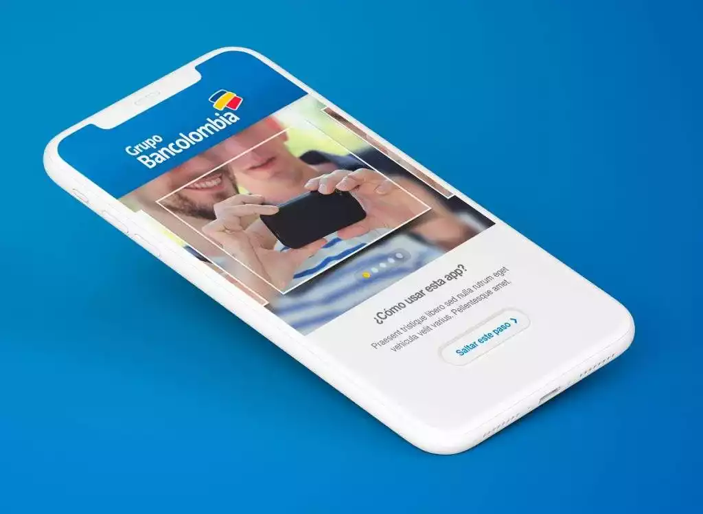
Our job is to create applications so simple and easy to use, that users don’t need an on-boarding screen to, theoretically, get an explanation about how the app works and what can be done with it. These explanations always end up with a Skip button, and nobody sees them. I understand that sometimes tasks on apps can be complicated, especially in the Fintech area. But our job is to make applications that are so easy to use, that anyone can use them without any help. Saturating the user with information when opening the app for the first time is usually not a good idea. Of course, not all cases are the same. I don’t intend to say that on-boardings should end in mobile apps. But we must assess whether the on-boarding will be something that the user needs or not. For example, in an application that we recently developed in Foonkie Monkey, users can send money to other users on a Blockchain network. In that case, adding information on how to make that transfer into the on-boarding would be a waste of time, since there are a lot more functionalities on the app. The users would probably not remember the instructions when they need them. It’s all about making the functionality so fast and straightforward that there is no need for a tutorial. In case the process is more complex, the explanation should be on the screen where the user sends the money and not at the beginning of the app. You also may like to read Software Development Companies
Listening to the User
As an app begins to be used, companies get feedback as KPIs, comments, and even calls from the same users. It is essential to listen to them to determine priorities in the evolutionary maintenance of the app. The new features to include should be those that users want/need to receive and not those that the bank or company can provide (although this is sometimes something idealistic).
If users stop using the application on a specific screen, it may be the indicator that something is wrong there. Features that have signs of much or very little use can highlight issues to be maintained, improved, or removed from the app.
Security
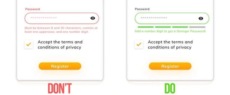
Security must be taken seriously in each phase of the app design. It is crucial to make users aware of having strong passwords and, while thinking about the best UX possible. Do not wait for the user to create a weak password, and warn (as a user’s mistake) how to strengthen the password. That creates a bad experience.
You may like to read Mobile App Design Companies
Fintech applications generally need a lot of user information. In some cases, for legal reasons, the users in a registry have to upload a selfie with their ID. In these cases, it is essential to explain to users clearly and friendly why the information is needed and how it will be used. This will give them confidence in the app.
It is recommended to collect and save only the user information that is really necessary. For example, in most cases, it is not necessary to keep the debit and credit card numbers for payments. It is recommended to use Tokenization, to allow the Token to identify the billing method. With that, the server requesting payment does not know the billing information, and thus, theft of sensitive information can be avoided.
Another important security method to include in apps is two-factor authentication. This method allows the system to verify the user identity in two different ways. However, this needs to be fast. The classic example is the use of the biometric components of the mobile devices (fingerprint or face recognition) combined with a PIN or password.
The Simpler, the Better UX
On the one hand, we have that fintech apps generally have tons of information to offer. On the other one, in some cases, we have users with small or low-resolution devices or with vision problems and/or in a constant struggle with the reflection of the outdoor light on the mobile device’s screens.
For this reason, it is important to simplify the information provided to the user, and present it in a hierarchical, meaningful, and actionable manner.
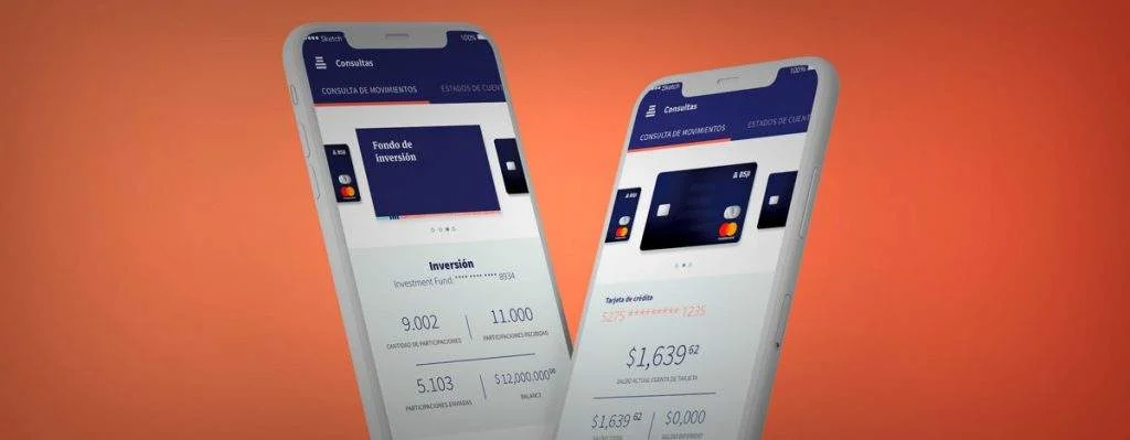
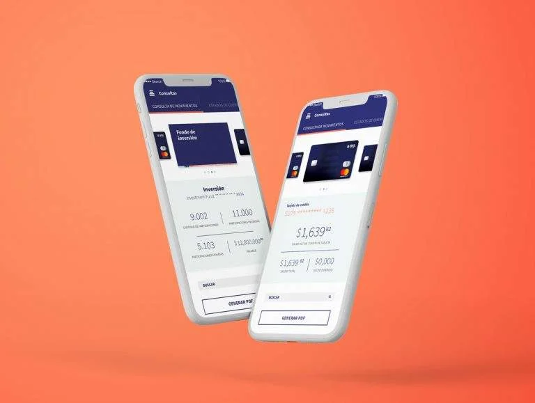
It is about presenting first, with greater size and contrast, and with easy-to-read sources, the most relevant information for the user.
It is always necessary to question what is the most useful information for the user. Sometimes, it is obvious (such as the balance of your account on the dashboard), but on other occasions, it is a bit more complicated. For these occasions, it is valid to conduct focus groups with the target users of the app. In that case, it is recommended to take advantage of the session to discover the habits of the users, which can give some fascinating insights.
Users have better UX in simple and easy to learn interfaces, where the brain can simplify the amount of information to be processed. This will make the user feel a sense of control over the application.
Oh Yeah, and the UX Basics
It is essential to choose a suitable typeface that facilitates reading, which works well in large and small screens, to be able to rank the information. The color palette must be chosen with detail and finesse. It is essential that it allows good contrasts between the background and the content to provide hierarchical, digestible, and entertaining information. Keep in mind that 60% of people decide if they are attracted to a product or message depending on their color. For each screen, it is important to ensure the user has a single action to perform. For this reason, the buttons that carry the Call to Action must be easily identifiable by their shape, color, and size on each screen. You may like to read Top eCommerce Development Companies Of 2020 according to DesignRush
The organization of the elements on the screen must be taken very seriously for a good UX. The visualization of the data must be defined by the priorities of the user and not by the taste of the client or the designer.
Developers, customers, and designers should place the user and how to create a good UX in Fintech Apps in the center of development. Put aside the whims of the client or the shift manager, the Product Owner, or the Scrum master and ask yourself: What will be best for the user? And if you don’t know, then it’s time to ask them directly.
Related article: 10 Best Examples Of App Landing Pages And What We Can Learn From Them – Top Mobile App Website Design Companies