At Foonkie Monkey, we are passionate about solving complex problems with simple, useful, and revolutionary solutions. Our drive has always been the same: to improve people’s lives through design and technology. This time, we identified a recurring challenge faced by millions of Colombians every year: filing their income tax declaration.
What should be a transparent, intuitive, and guided process often becomes a frustrating, confusing, and inefficient experience. The available platforms—particularly the official DIAN portal—showed clear signs of obsolescence both in user experience and visual design.
So, we decided to take action: we researched, diagnosed, restructured, and redesigned the entire tax declaration flow, from the user’s first interaction on the website to the final document generation.

1. Diagnosis: Identifying Pain Points
The first step was to analyze the current experience of users entering the DIAN portal. From the search engine, the first screen displays a banner that leads to an informational page about income tax declaration. While this page fulfills an informative purpose, we identified several key opportunities for improvement:
- There is no direct button for “Declare your taxes here”, forcing users to go through multiple unnecessary screens.
- The color palette, typography, and visual structure vary between pages, breaking visual consistency and disorienting the user.
- Login and account creation buttons are hidden below extensive scrolling, delaying critical actions.
- Calls to action (CTAs) lack visual hierarchy; for example, the main banner occupies the first screen but uses a black button that fails to highlight the primary purpose of the flow.
- Navigation could be optimized with a persistent sidebar menu, keeping the most relevant options accessible across all pages.
- The design lacks human elements such as photographs or illustrations of people, which could convey warmth and trust.
- Whitespace and information hierarchy need a more open, legible, and user-centered reorganization.
In summary: the system met its technical purpose but remained outdated for decades, devoid of emotional connection or cognitive ease. The experience urgently needed empathy, clarity, and consistency.

2. Rethinking the Experience: User-Centered UX
Based on the diagnosis, we designed a new flow that prioritizes user needs and expectations. Our focus was to reduce friction and enhance contextual guidance at every stage of the process.
In the new experience, users can:
- Quickly identify where to start thanks to a clear and prominent CTA: “Declare here.”
- Log in or register easily from the header, without extra scrolling.
- Navigate between sections seamlessly through a fixed vertical menu that ensures consistency and quick access to key features.
- Feel more connected through a warmer narrative and a more human visual language.
- Receive clear feedback via intuitive copy and iconography throughout the interface.
Additionally, we designed a standardized login screen aligned with the overall visual system, eliminating visual breaks and strengthening the platform’s identity.

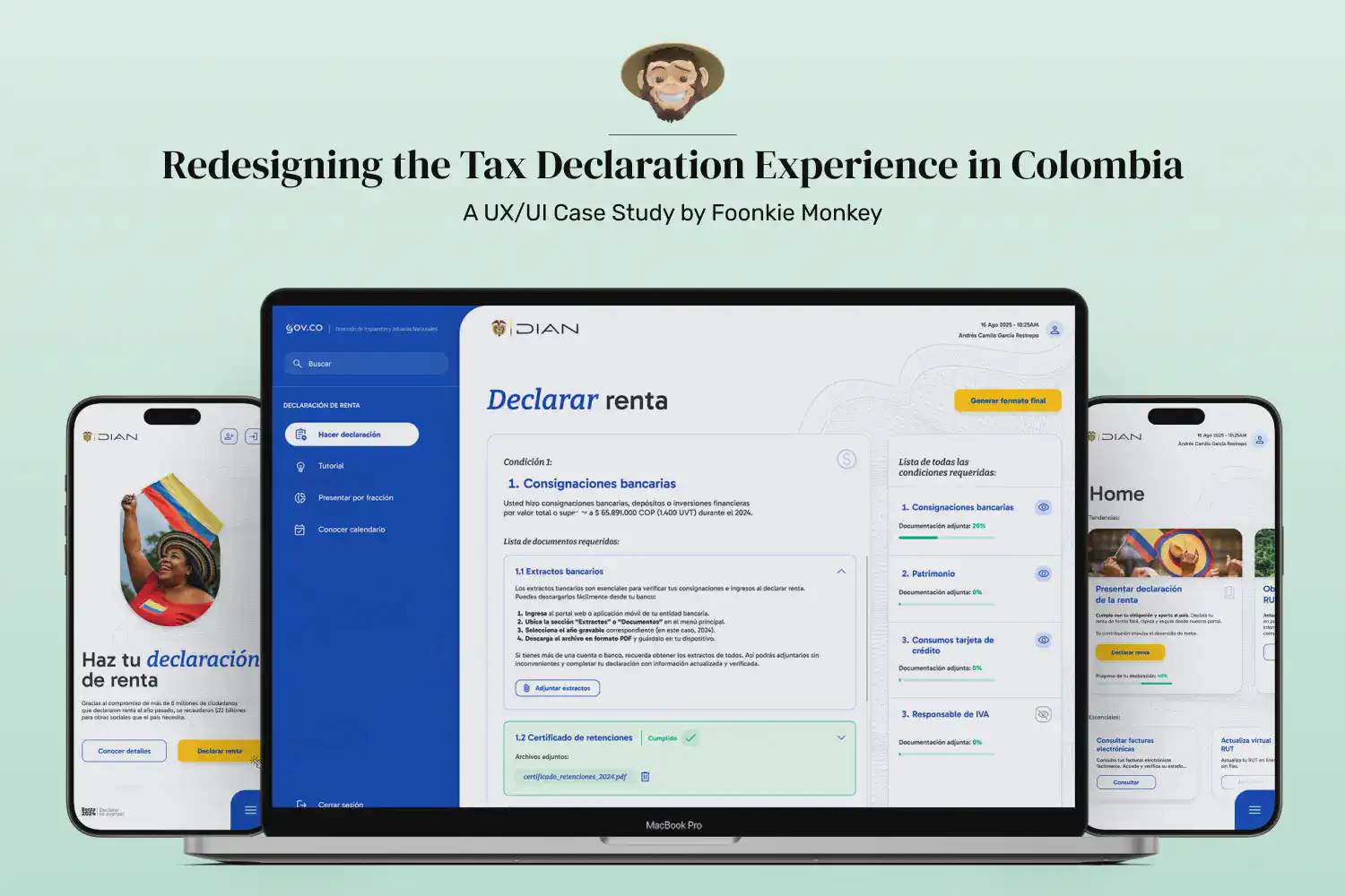
3. Redesigning the Declaration Flow: Guided, Informative, and Automated
The core of this project was the complete redesign of the tax declaration screen, the most critical and frustrating point for users.
In the current portal, the section that explains declaration requirements is purely static. We decided to turn it into an interactive and personalized experience, capable of guiding each citizen step by step.
In the new flow:
- Users can see which conditions apply to their case (e.g., bank deposits, assets, income, etc.).
- For each condition, the interface displays the required documents, along with precise instructions on where to obtain them and how to upload them.
- Each category includes dynamic progress bars that fill as users upload documents, creating a sense of progress and control.
- Once all documents are uploaded, the platform—through AI or automated data-reading scripts—extracts the necessary information and generates the final tax declaration PDF automatically.
- Users can save progress, create drafts, or edit and delete documents at any time.
This way, even someone filing taxes for the first time can do so confidently, guided by a logical, visually clear, and self-assisting interface.

4. Visual Design (UI): Consistency, Accessibility, and Modernity
With the experience architecture defined, we moved into the visual design phase. Our goal was to create a coherent, accessible, and adaptive visual system that supports the entire flow across desktop and mobile devices.
In this stage, we developed:
- A unified color palette that reinforces institutional identity while adding freshness and contrast to highlight key actions.
- A clear typographic hierarchy, allowing users to read and scan information effortlessly at every level.
- A modular column-based layout with balanced margins and spacing, naturally guiding users’ attention toward each screen’s main action.
- A fully responsive system, previously nonexistent in the original platform, ensuring an equally intuitive experience on mobile or tablet.
The result is a modern, human, and efficient interface that transforms an obligatory process into a clear, fluid, and even educational experience.

5. Conclusions: From Bureaucracy to Experience
This case study reaffirms our commitment at Foonkie Monkey: Design is not only about making things look beautiful—it’s about solving real problems with strategic vision and empathy for the user.
The redesign of DIAN’s tax declaration flow is more than a visual exercise; it’s a reimagination of how technology and design can simplify public processes and bring citizens closer to a more transparent, efficient, and human system.
Every click matters, every design decision has an impact, and every well-thought-out experience can reshape how people perceive an institution.
At Foonkie Monkey, we believe the future of design lies in making it invisible: when everything works so seamlessly, the user only feels ease.