Redesigning healthcare software goes beyond simply refreshing its appearance—it demands a strategic focus on good UX/UI design practices, usability, compliance, performance, and accessibility.
A well-crafted app is crucial for maintaining user engagement. However, since user expectations evolve rapidly, it becomes starkly evident to us app developers and designers that outdated interfaces, sluggish navigation, and subpar user experiences will result in pain points, increased churn rates, and poor user engagement. This is especially critical for healthcare software, where seamless design can enhance patient outcomes, ultimately saving lives. No one knows this better than us.
One of those healthcare software solutions is Macrotech’s Madih, a medical platform that hospitals, clinics, and other healthcare settings use to set appointments, modify and enter patient info, streamline medical workflows, simplify billing services, schedule appointments, and much more. This platform currently serves a clinic in the Dominican Republic (with upcoming presence in Mexico) where patients typically go and, for commuting purposes, get various checkups and procedures done on the same day. The software initially had myriad UX/UI shortcomings that hindered its efficiency and created countless pain points for healthcare professionals and other stakeholders, making it evident to us that it was in dire need of a rehaul.
Let’s explore the details of how and why we redesigned Madih’s UX/UI and gave it a seamless user experience and a beautiful interface, all while supporting secure, HIPAA compliant standards and data security practices.
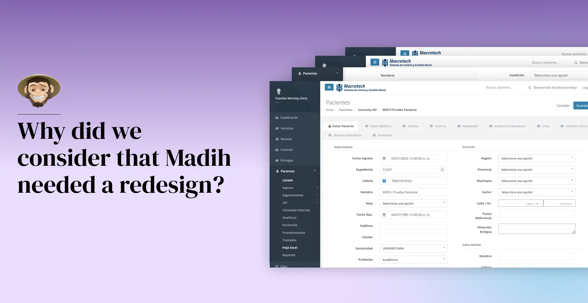
Why did we consider that Madih needed a redesign?
When Madih’s original version was given to us, our UX/UI designers quickly identified critical usability and performance bottlenecks that hindered healthcare professionals from delivering efficient, high-quality care. The platform suffered from visual clutter, cognitive overload, disorganized workflows, and inefficiencies that disrupted clinical operations and delayed decision-making, ultimately affecting the provider’s ability to deliver timely and effective medical services.
After conducting extensive research and diagnosing the platform’s issues, we decided to completely overhaul Madih’s existing user experience. This included changing the look to match Madih’s new brand identity and a total interface redesign that made the platform more user-friendly, streamlined, and efficient. Let’s take a deeper look at our multi-phased redesign process.
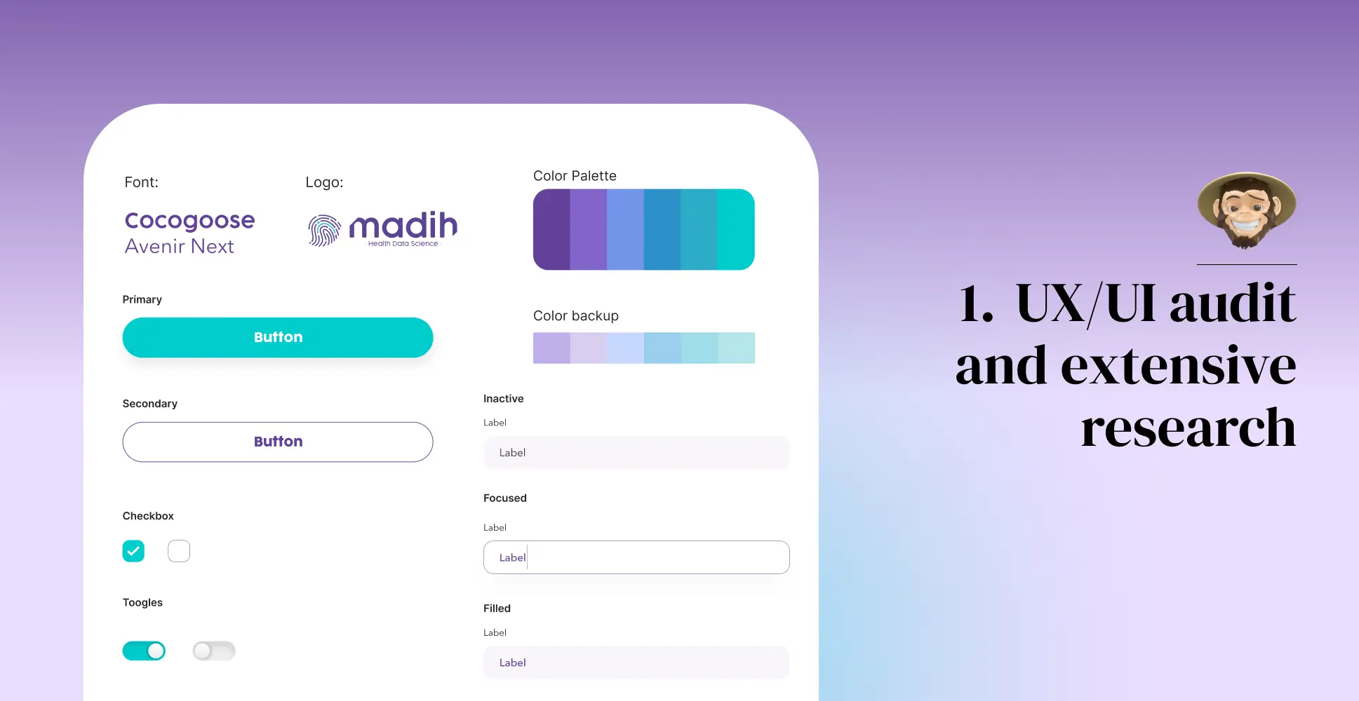
1. UX/UI audit and extensive research
From the outset, we recognized that Madih manages vast volumes of critical medical data. However, the platform struggled with an overwhelming cognitive load and countless pain points imposed on users. Our comprehensive UX/UI audit identified key issues that hindered efficiency and usability, including:
Countless hidden forms and never-ending submenus. We learned that everything was displayed on a single screen without straightforward navigation, structured tagging, or filtering options, making it nearly impossible for healthcare providers to access only the data relevant to their specific needs.
Fragmented data visualization. One of Madih’s most significant issues was a lack of information architecture. There was no way for physicians to know which patient they were seeing, why they were seeing them, and what the patient’s history was before the appointment. There was also a lack of intuitive workflows and inferior, non-logical navigation structures that led to ineffective decision-making processes and reduced productivity for analysts, caregivers, and administrative staff members.
Cumbersome data retrieval. The system failed to provide a streamlined way for doctors to access fundamental patient information (such as height, weight, and risk factors) without navigating through multiple layers of forms and manual data retrieval processes. There was no centralized location displaying a patient’s key medical details, leading to workflow disruptions and prolonged administrative tasks during consultations.
Appointment setting issues. For analysts, the old portal presented several usability pain points, particularly when scheduling patient appointments and managing new patient entries. Analysts faced bottlenecks, endless confusing forms, and a lack of real-time access to essential patient records.
Repetitive data entry. When creating or modifying patient records in the forms, physicians had to re-enter all the essential patient details every time, reducing workflow efficiency. Also, when filling out forms, the data was only retrievable via a PDF file that could only be visualized by printing or saving it to the computer.
Super admin issues. For administrators, modifying user permissions was a rigid, confusing process. It was cumbersome to assign specific roles, and some security configurations lacked granular control.
Limited cross-specialty collaboration. Since patient data wasn’t categorized efficiently, multiple specialists working with the same patient lacked quick visibility into critical medical history, medications, and ongoing treatments. Doctors had to search for a patient, open an extensive set of forms, locate the relevant section, click “edit,” and hope the necessary information was available quickly.
To tackle these challenges, we conducted extensive research on data traffic management and cognitive overload in healthcare platforms. This deep dive enabled us to better pinpoint Madih’s core usability issues, workflow inefficiencies, and accessibility barriers. By leveraging this structured analysis, we established clear, strategic objectives to drive our redesign, ensuring a more intuitive and user-centric platform.
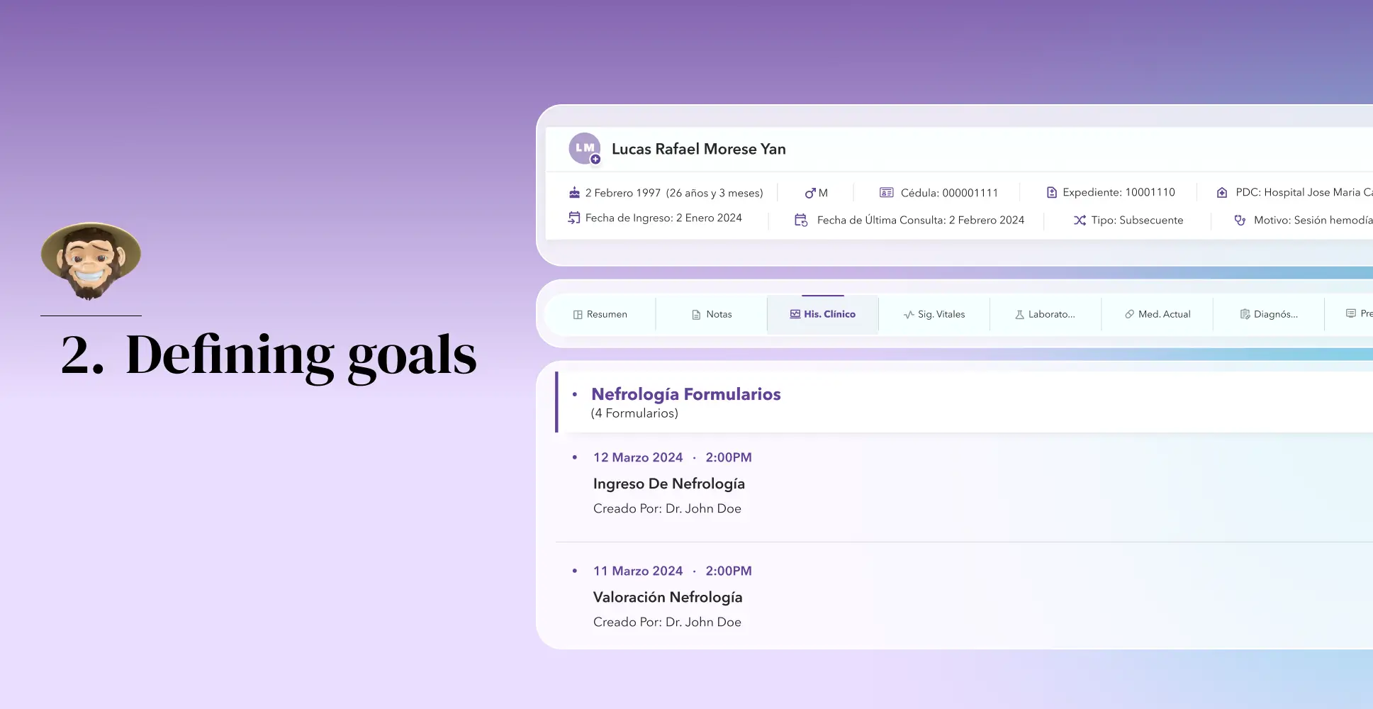
2. Defining goals
Our vision for Madih was to create an intuitive, efficient, and user-friendly healthcare solution. To achieve this, our team of UX/UI designers has set the following goals, each of which is a crucial step towards realizing our vision.
Our primary goal was to optimize the information architecture and navigation of the old platform, ensuring that the new one was user-centric and avoided cognitive overload, disorganized data, pain points, and the endless submenus that led nowhere (especially for physicians).
Our redesign strategy was centered on the user. We aimed to clearly redefine the roles within the platform (admin, doctor, analyst, etc.,) and restructure data presentation so that each individual could easily access the data only relevant to their specific role.
We wanted to introduce categorization, auto-fill, tagging, and filtering to streamline data retrieval and help physicians access each patient’s historical information seamlessly.
We also aimed to create a fresh and aesthetically pleasing interface with elements that enhanced the user experience while also aligning with the brand’s new identity.
We wanted Madih to be highly scalable and adaptable to the needs of any other medical setting beyond Macrotech.
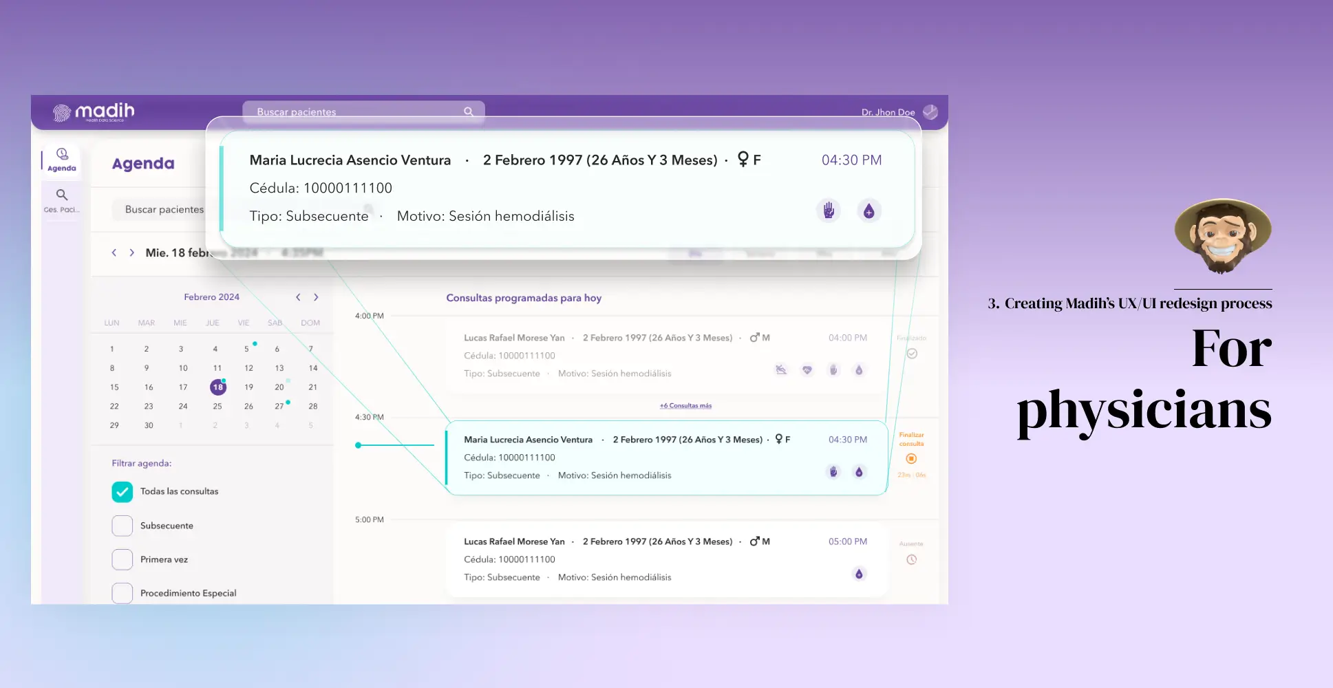
3. Creating Madih’s UX/UI redesign process
With clearly defined objectives, our UX/UI design team launched the redesign strategy by leveraging advanced wireframing tools to precisely structure content layouts, map intuitive navigation flows, and strategically position essential UI components to align with our redesign goals. Using Figma, we developed low-fidelity, mid-fidelity, and high-fidelity wireframes, each undergoing rigorous validation cycles to detect and resolve UX/UI challenges early. This iterative approach allowed us to fulfill our goals and optimize complex workflows, resulting in a more intuitive, scalable, and user-friendly digital experience. Below are the key enhancements we implemented.
For physicians
Appointment data
The first thing we created was a new “Scheduling” section where physicians could seamlessly access all the data relevant to each patient daily. This section was inspired by the Google Calendar interface, and we adapted it to meet the qualities and requirements of an appointment scheduling tool. It consists of:
A calendar where users can easily visualize and select days, weeks, months, and years. Doctors can simply click on any day, visualize the appointment data for that specific day (past or present) and select any appointment to access a quick view of that specific patient’s information (date, time, blood type, weight, reason for appointment, etc). On that quick view, physicians can also access patient history, risk factors, allergies, accessibility needs, and more.
An option to filter by appointment type (first-time patients, special procedures, check-ups, etc,.).
A patient search bar.
The option for physicians to start or cancel an appointment is a capability that was only previously available to analysts.
Patient files and medical records
Our solution to Madih’s lack of cross-specialty collaboration was a dedicated patient information module that provided doctors instant access to essential medical data, eliminating the need for repetitive data entry and fragmented record navigation. This hub included:
Core patient information panel: A static top-section display containing a patient’s core medical information that physicians can access directly from the calendar or the patient search bar. This helped us ensure that critical details are always visible without requiring additional navigation.
Alerts section: On the core patient information panel, we added an alert section where doctors could flag critical conditions, medication allergies, and emergency protocols so that healthcare providers could immediately identify high-risk cases or essential care requirements.
New patient data forms: We completely redesigned patient file forms to be more modern, intuitive, and user-friendly. We simplified input fields, added more space between fields, and eliminated the cognitive overload and clutter. We also introduced graphs so doctors could see changes in vital signs over time.
Data entry: When creating or modifying patient records, Madih now automatically retrieves existing patient details, reducing administrative workload and allowing doctors to focus on treatment rather than data entry.
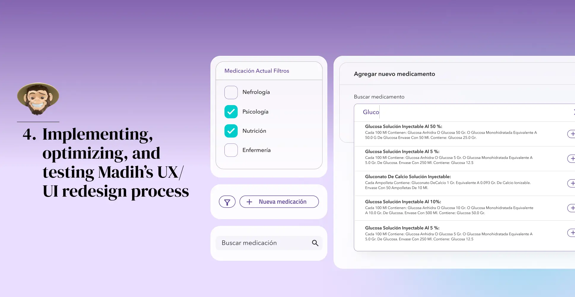
Medication entry panel: We introduced a dedicated medication entry panel within the patient’s file, allowing doctors to add and modify prescriptions directly from the patient profile without navigating through multiple confusing menus. We added a search bar, similar to Google’s search engine, where physicians can now enter the first letters of any medication, and the engine auto-suggests the available options via a drop-down menu. Once a selection is made, doctors can quickly specify dosage, administration details, and frequency.
Categorization tab: Given that Madih typically serves multi-specialty healthcare providers for a single patient, we designed a tab structure that is placed below the core patient information panel. These tabs organize patient data into relevant categories such as medications, appointment summaries, vital signs, test results, notes, and a specialty-specific data module that is customizable for each doctor.
Role-based permissions: To enhance data security and compliance, we implemented access permissions based on each role, ensuring that sensitive data remains protected while maintaining collaborative data sharing across departments.
For admin roles (Analysts and Super Admin)
For Analysts
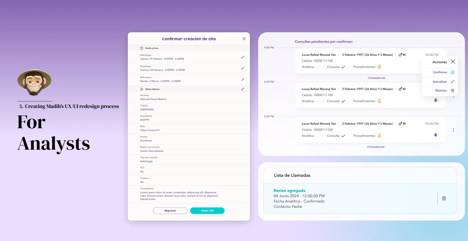
Analysts are the people within the organization who add new patients and schedule appointments. We completely restructured the calendar and their portal to:
Visualize a panel where they can find relevant data, such as current appointments, with an auto-fill functionality that preloads patient details when linking a new patient to an existing record, eliminating redundant data entry.
Easily schedule, modify, cancel, or edit various appointments per patient.
Advanced filtering options allow them to sort by file number, ID, doctor, specialty, or time slot, ensuring efficient booking and conflict-free scheduling.
Access a new timetable where analysts can now see how many patients are scheduled for a particular day and the reason for their visits. They can also reassign patients to different specialties based on available time slots, ensuring optimized resource utilization and better patient distribution.
Access and modify a new section called “Call List,” where analysts can see if a patient was contacted to confirm their appointment and if they canceled or rescheduled.
For the Super Admin
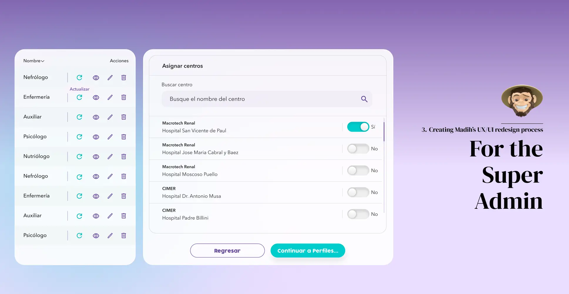
Super Admins oversee role management, user access, security protocols, and system-wide configurations, making their workflow efficiency and governance capabilities critical to Madih’s success. To streamline these operations, we developed a powerful and intuitive Super Admin panel that enables them to:
Create, modify, and assign user roles (e.g., doctors, nurses, analysts, and administrators) with granular permission controls.
Leverage a permissions-management system, where new doctor profiles can be configured using a dynamic permit pane with intuitive toggle controls, allowing admins to enable or revoke access to specific functionalities based on individual roles within the organization.
UI enhancements
A critical part of Madih’s redesign was aligning the platform’s visual elements with its new brand identity while ensuring a seamless, modern, and user-friendly experience. Our team of designers focused on improving the navigational structure readability, reducing cognitive load, and reinforcing the brand’s consistency by:
Using a color palette consistent with Madih’s new branding, shades of purple and blue play a key role in the platform’s visual hierarchy while reinforcing a professional healthcare aesthetic.
Introducing rounded corners across panels, buttons, and input fields to make the UI softer, more approachable, and convey a sense of calmness.
Adding more space and air between elements to improve content legibility and build a more fluid, less cluttered interface.
Selecting a modern, contrast-optimized, healthcare-friendly typography that balanced professionalism with readability while also reducing cognitive load and supporting the new brand’s identity.
Making all these elements highly scalable and editable to ensure future use by another brand is seamless and as user-friendly as possible.
Our highly structured redesign approach not only helped us enhance Madih’s usability, navigation efficiency, and system performance but also laid the foundation for a seamless transition to the full implementation of the redesigned platform, ensuring a more intuitive and scalable digital experience for our users.
4. Implementing, optimizing, and testing Madihs UX/UI redesign process
After finalizing the research, planning, and wireframing processes, our team was ready to transition into the implementation phase, where design elements were transformed into a fully functional healthcare platform, ensuring that every element—from navigation menus to data entry fields—was intuitive and responsive. This phase demanded close collaboration between UX/UI designers, developers, and healthcare stakeholders to ensure that every interface element was visually cohesive, functional, scalable, and optimized for real-world medical workflows.
We also implemented frontend and backend enhancements, integrating Madih’s new and improved UX/UI with the underlying database and healthcare infrastructure while maintaining compliance with industry standards such as HIPAA and GDPR. We also conducted iterative testing cycles, including usability testing with real users, performance benchmarking, and security assessments. These tests allowed us to fine-tune system responsiveness, eliminate inefficiencies, and strengthen data protection protocols to meet the stringent demands of the healthcare industry.
Final word
Foonkie Monkey’s Macrotech’s Madih’s platform redesign was based on extensive research and preparation and focused mainly on developing a strategic transformation that enhanced the usability, accessibility, and efficiency of healthcare professionals and patients. The redesign was a collaborative effort involving app developers and designers to address the healthcare software’s main pain points, such as complex navigation, visual clutter, color inconsistencies, slow workflows, and cognitive data overload. Madih’s redesigned interface seamlessly merged aesthetic improvements with functional enhancements, creating a user-friendly, interoperable, and scalable healthcare platform ready for real-world application.
At Foonkie Monkey, we specialize in healthcare software development, creating cutting-edge, user-centric solutions that enhance medical workflows and improve patient care. Our expertise in UX/UI redesign allowed us to transform Madih into a scalable healthcare platform that meets the evolving needs of medical professionals and patients alike. If you’re looking to modernize or redesign your healthcare platform for better usability, security, and efficiency, let’s talk!


